At the beginning of the week, I was having a rough day and needed a creative distraction. Scrolling through my writer’s group, I stumbled across a fellow author struggling to choose a cover for his upcoming book.
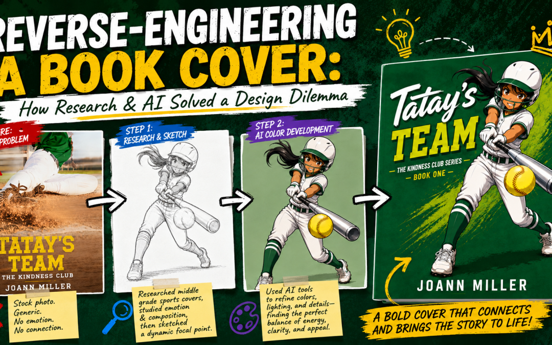
He had uploaded two options and asked the group to vote. The comment section was a stalemate—most voted for the girl hitting a softball, but there were a lot that suggested to come up with another design.
I reached out and asked him about his book's genre and what comparable covers in his niche looked like. He mentioned that most of them felt too cartoony for his taste, though a few used realistic characters.
I asked if I could take a crack at it to see if we could find a clearer direction.


Pin this post
Step 1: Analyzing the Market
Instead of guessing what might work, I started with market research. I jumped onto Amazon and pulled eight top-performing covers in his genre—specifically targeting books that were selling well and had strong reader reviews.

To extract the visual patterns driving those sales, I uploaded all eight covers into a Large Language Model (LLM) with a simple prompt:
Take these book covers and give a detailed breakdown of the common elements between them. Include a style and color guide.
The model returned a comprehensive breakdown of layout, typography, character placement, and color palettes. But one specific insight immediately stood out:
Every cover features a single dominant protagonist.
Usually:• Occupies 45–70% of the cover space
• Centered
• Facing the viewer or positioned at a 3/4 angle
• Full body or nearly full body
That was the blueprint. We didn't need a crowded scene—we needed a striking, dynamic shot of the main character taking center stage.
Step 2: Sketching the Concept
I asked the author for specific details about his protagonist so I could sketch her out. I wanted an active, energetic pose that captured the movement of the sport while putting the character front and center.
Here is the initial sketch I came up with:

When I shared it with the author, he loved the direction, but pointed out one critical detail: his protagonist hits left-handed.
Fortunately, that was a quick fix. I mirrored the image horizontally and removed the lettering on the uniform (which was mostly hidden anyway) to prevent it from displaying backward.
Step 3: Color & Style Prompting
Using details from his initial cover attempts and his character description, I fed the sketch back into the AI to apply flat, anime-style shading:
"Take this cleaned-up image and do an anime-style shaded coloring. Make the softball traditional yellow. The girl has brown eyes, black hair, and olive-colored skin. The uniform is white with forest green highlights and forest green socks. Give the bat a silver sheen like an aluminum bat. Make the linework bold and consistent with anime style. Put this on a solid-colored background that complements the other colors."
The tool executed the rendering cleanly:


Step 4: Typography & Formatting
Normally, I would jump straight into Affinity Photo to hand-type and layout the title and author name. But since the entire market analysis was already loaded into the chat context, I decided to test how well the model could apply its own typography layout rules.
Now I need this image in the appropriate aspect ratio for Amazon KDP. Add the author 'Joann Miller & J. W. Jones', the title 'Tatay's Team', and the subtitle 'The Kindness Club Series - Book One'. Do not change the character pose.
Pro-Tip: Always explicitly instruct the AI not to modify the underlying pose or character art when adding text. If you skip this step, AI models will frequently regenerate the entire image, giving you awkward pose changes or altered features.
Here is the resulting cover mockup built on the market research data:

Because the generated image output was a bit small for high-resolution print standards, I ran it through an AI upscaler to boost the pixel density before bringing it into Affinity to set the exact dimensions required for KDP publication.
Bonus Step: Building a Character Reference Sheet
As a final touch, I wanted to provide the author with a tool to keep his main character visually consistent for future book covers or promotional materials.
Using the finalized artwork, I prompted the AI to build a reference sheet:
Create a character reference sheet for this character showing her from all angles, with and without her helmet. Include various facial expressions. Also include a single image of her in school attire, but not her sports uniform.
Here is the reference sheet it produced:

Now, whenever he needs new cover art or interior illustrations for future books in the series, he can upload this reference sheet into an image generator to maintain character consistency across every release.
What do you think of this workflow?
Using market research to guide AI generation takes a lot of the guesswork out of cover design while making sure the final product actually fits genre expectations.
Have you tried using LLMs for market analysis or design layouts? Let me know your thoughts or questions in the comments below!
Chack out the book on Amazon (cover will change after the ARC period) https://www.amazon.in/TATAYS-TEAM-KINDNESS-JoAnn-Miller-ebook/dp/B0H6VQFGY6